(This was originally published in 2013 on my other blog, but since it was the only post, I decided to consolidate. I keep telling myself I need to write more, but hey, I’m slow—and that’s all I have to say about that.)
Apparently one of Chuck Jones’ cardinal rules for Roadrunner and Coyote cartoons was, “The audience’s sympathy must always be with the Coyote.” They were largely successful on that count. The guy couldn’t catch a break, much less a running bird. Just an everyman trying to feed himself in a dangerous and unforgiving environment, Coyote always managed to screw up his elaborate schemes to capture and make a meal out of the Roadrunner. With all due respect to PETA, we all know the Roadrunner would have deserved it. But Coyote was always at the mercy of his own ineptitude and the faulty product design of the notorious, ACME Corporation. He was also easily fooled by skeuomorphs. Admit it. You know you’ve yelled at your TV screen a few times, “Don’t do it, Coyote! Don’t do it!”
Skeuomorphism might be the longest word in the average graphic designer’s vocabulary—at least it probably is in mine. And since it has become the common enemy of some who think-about-graphic-design-for-a-living, much of the rest of the design community assumes it must be a bad thing. Apparently the mere existence of skeuomorphism causes indigestion among a certain class of design purists who, like the disciples of Walter Gropius, and Adolf Loos before him, believe they have found the Holy Grail of Design and are now equipped to usher in a Utopian age where all pretense, dishonesty and bourgeois ornamentation can be stripped away to reveal Capital-T-Truth. Well, at least this year’s Capital-T-Truth.
According to Wiktionary, a skeuomorph is defined as “a design feature copied from a similar feature in another object, even when not functionally necessary.” Wiktionary also tells us that use of the word traces back at least as far as 1889, which should serve as a reminder to the design-hipsters cum baristas that they aren’t really on the cutting edge of either art or language evolution. (If you want to jump right in to the deep end and really impress the latte crowd, try this debate over the fundamental meaning of the term. As for me, I am using the term to mean what it has become in the vernacular: Apple looks kitschy.)
So when your screen background looks like a piece of “fine Corinthian leather,” or your Google earth icon has beveled edges, or your iBooks interface looks like a wooden bookshelf, that is skeuomorphism. The horror.
When Apple first popularized a graphic user interface back during the Stone Age, they were attempting to put a face, or perhaps better, a skin on a technology that few people understood. Steve Jobs and crew were creating the “computer for the rest of us” by using visual metaphors that we all recognized in order to enable us to use this new technological marvel. No longer did we need to know the rudiments of programming language or even “C-prompts” on a green screen in order to navigate around the Matrix. Instead we got familiar-looking file folder icons and document icons that emulated dog-eared pieces of paper, a now politically incorrect bomb with a lit fuse, and the ever-dreadful dead Mac icon with the upside down smile and x’s for eyes. We navigated—the term itself is a verbal skeuomorph—through the computer by pointing and clicking at items and buttons on the screen. Pointing, of course, was a violation of the rules of etiquette but we were all familiar with it. The buttons weren’t really buttons, they just looked like it. And clicking, especially with the magical transformation that occurred once you did it, gave the user a sense of power. Admittedly it was power in an alien world, but does it get any better than that? For those of us who were familiar with rubber cement, wax, X-acto knives, t-squares, rubylith, type books, proportion wheels, galleys and the stimulating smell of printer’s ink, getting to use a Macintosh was like being handed the keys to the Space Shuttle. Once they added color and higher resolution, we were no longer merely orbiting the earth. It was infinity and beyond.
Those first Mac icons, largely designed by Susan Kare, were pretty primitive though brilliant for their time, in a way like the guano drawings on the Magura Caves. You do the best you can with what you have. The original Mac had a bit depth of 1, in other words, black or… wait for it… white. As bit-depth/resolution improved it was to be expected that the detail on those original icons would evolve—and clearly they did. So we wound up with beveled edges, sophisticated shadows and color schemes, backgrounds that look like paper, or wood, or marble, or galaxies or whatever in the real world a designer might imagine, all used with the best of intentions. Looking like an actual notepad can be an immediate way to communicate to the user what a virtual notepad is and how to use it. Early iPhone and iPad icons became celebrations of dimensionality bordering on trompe-l’oeil, as did the interfaces within the applications they represented.
Trompe l’oeil is a recognized and celebrated category of art, unlike skeuomorphism, although both are darn near unpronounceable. You can find some astonishing examples here. If you’ve been to Las Vegas and seen the ceilings in the Venetian Hotel or in the Via Bellagio, you’ve seen trompe-l’oeil. Frankly, you could make an argument that the entire Las Vegas strip is a monument to the ersatz—trompe l’oeil and skeuomorphism unabashedly presented as reality. For a more familiar example, but still from a desert in Nevada, think of Wile E. Coyote painting a tunnel on the side of a canyon wall to fool the Roadrunner. When Roadrunner turns the corner and runs into the newly created tunnel, Wile E. tries to follow, with the expected result. He crashes into the canyon painted stone and gets “flattened” against the wall. Despite what ol’ Wile E. may have thought, even the kids watching the cartoon knew it wasn’t a real tunnel. Kids, of course, are smarter than coyotes (and adults for that matter, most of whom think that Las Vegas is a real place.)
Kids are also smarter than many philosophers of design. At least my kids are. They absorb visual metaphors like breathing. They never, ever had to answer the angst-ridden question of “Mac or PC?” They don’t care. If it has a screen they can operate it, and they know without thinking about it that their fingers are not going to slip off a virtually beveled edge. So they are not fooled by skeuomorphic details. Neither are they offended by them. I never had to utter the words, “Son, you know that leather background isn’t real, don’t you?” Had I done so I would have gotten the same look of consternation when I asked my then six-year-old if he realized the magic in Harry Potter movies wasn’t real. “Seriously? Dad? It’s just a movie.”
Apple’s work on interface design ushered in a golden age of ornamentation, perhaps even arresting the Modernist trend to the point where, in 2005, Eye Magazine could declare “The Decriminalisation of Ornament,” (a direct reference to Adolf Loos’ “Ornament and Crime” which argued “The evolution of culture is synonymous with the removal of ornament from objects of daily use.” ) But now, after years of increasingly realistic looking, but fake, bevels, shadows, colors and textures among iPhone visual elements, designers, especially user interface (UI) designers, have scraped themselves off the wall of the virtual canyon and decided they are once again allergic to ornamentation. But these days it is more fashionable to use (or perhaps, misuse) the term “skeuomorphism.”
This issue turns out to be a pretty ancient problem. The guano painter in the Magura cave didn’t have an alphabet and knew nothing of taxidermy that would have enabled the hanging of a stuffed animal as a trophy on the wall. Instead, he or she drew a picture, with sufficient detail to communicate, but no more. You could even argue that those drawings were the very essence of flatness so desired by modern UX design purists. 15000 years later (though still 17,000 years before Jonathan Ive was even born), the artists of the Lascaux cave paintings added color, dimension, perspective and ornamental detail to the mix. I’m guessing the Lascaux paintings were called skeuomorphic by the art critics of the Paleolithic Era. But I doubt the artist or anyone else for that matter, Wile E. Coyote-style, confused the pictures on the wall with actual animals.
Tom Wolfe, in his brilliant skewering of modern art and architecture, From Our House to Bauhaus, reports an exercise by Josef Albers, an early Bauhaus instructor, that clearly explains the purist attitude toward skeuomorphism:
“Albers would walk into the room and deposit a pile of newspapers on the table and tell the students he would return in one hour. They were to turn the pieces of newspaper into works of art in the interim. When he returned, he would find Gothic castles made of newspaper, yachts made of newspaper, airplanes, busts, birds, train terminals, amazing things. But there would always be some student, a photographer or a glassblower, who would simply have taken a piece of newspaper and folded it once and propped it up like a tent and let it go at that. Albers would pick up the cathedra and the airplane and say: “These were meant to be made of stone or metal—not newspaper.” Then he would pick up the photographer’s absentminded tent and say: “But this!—this makes use of the soul of paper. …This!—is a work of art in paper”
At the risk of appearing ambivalent, let may say simply, “BS!” If we were to follow his logic—beyond where even Albers seemed to go—we might reach the conclusion that one ought not make anything out of something else, since the original materials are best suited to be just that, the original materials. Wood is best used for trees, not newspapers or cornices; sand is better suited to remain as sand rather than turned into crystal goblets or the glass facades of Bauhaus Big Box Architecture. In fact, by following Albers’ logic we might eventually do away with all forms of not merely ornamentation, but representational art and even color, as some Bauhaus influenced trend-setters wanted to do. Although the leading edge of smartphone interface design today looks like Ellsworth Kelly color explorations, you just know someone is going to eventually argue for all black and white. Seen the Drudge Report lately?
I do confess to a certain sympathy with the anti-skeuomorphic crowd. (Then again, I tend to root for Wile E. Coyote, too.) I have a visceral disdain for wood-grained laminate countertops and printed faux-wood wall paneling. It seems to me that if you want your countertops to look like wood, you ought to use wood—especially since a chef friend of mine once told me that real wood has chemistry that helps kill the bacteria on its surface. But even at that, I wouldn’t turn down a meal served on a Formica counter. Heretically, I find the iPhone’s icon-oriented interface to be more clutter than order, even as executed in iOS7, and although I am an unrepentant Apple fanboy, all those flat squares in Windows Phone 8 are clean, simple and attractive. How effective they are as navigational tools, I have no idea. And I also know that they are “buttons,” regardless of how preciously flat they appear.
For Gropius and his followers in the Bauhaus this intense desire to eschew ornamentation was about politics. The assumption was that ornamentation was expensive and therefore, only members of the bourgeoisie could afford it. The search for “flatness” became a political, as well as artistic, movement. Roger Scruton describes the modernists and their agenda this way: “They were social and political activists who wished to squeeze the disorderly human material that constitutes a city into a socialist straitjacket.” So it is not surprising that, in an era when the cultural desire for socialism is in ascendance, we might return to a fear of bourgeois ornamentation.
Such simplification is tempting, and when presented as the manifestation of (faux-) humanizing ideals, eliminating ornamentation takes on a certain (equally faux-) nobility. But just because a group of design philosophers want to protect the masses, whom they presume must be fooled by the painting of a tunnel on a canyon wall, doesn’t mean we have to fall for that sort of reverse-elitism.
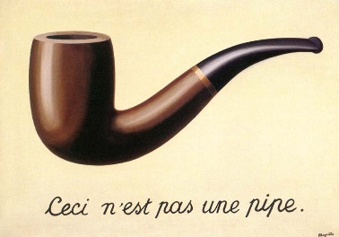
René Magritte, made the point back in 1928, with the inscription on his painting “The Treachery of Images.” “Ceci n’est pas une pipe.” (This is not a pipe.) We know. We also know that on-screen buttons are not really beveled, the clicking sounds are not mechanical, the calendar doesn’t have a real leather border, the picture of our kids on the lock screen is not really our kids, the cars and trucks in Transformers didn’t really transform, and Skeuby Doo isn’t a real dog. Unless the day comes when we can jack ourselves directly into the Matrix, I imagine that human beings will always prefer a little visual metaphor— maybe even a little kitsch—with our computer interfaces.
